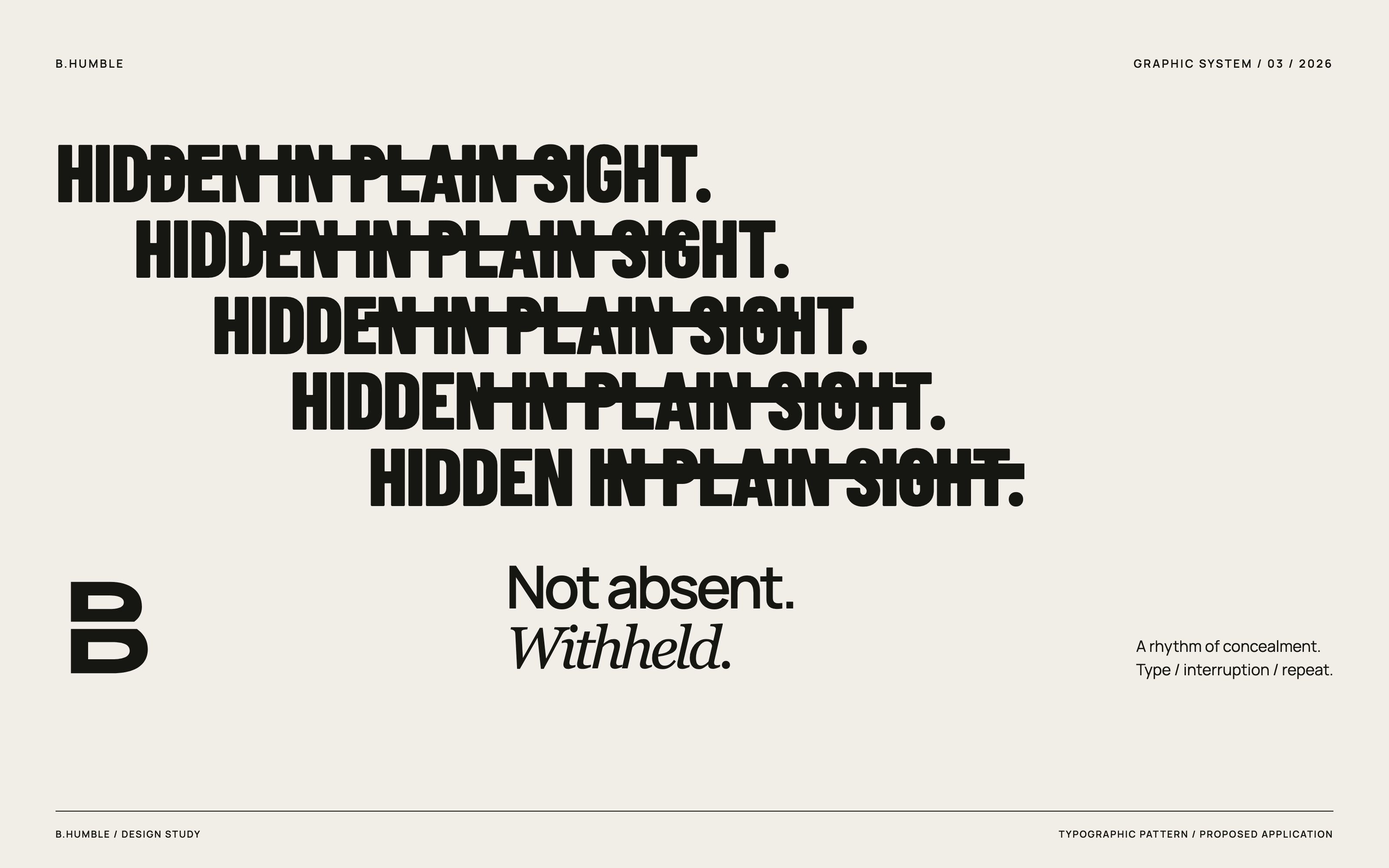
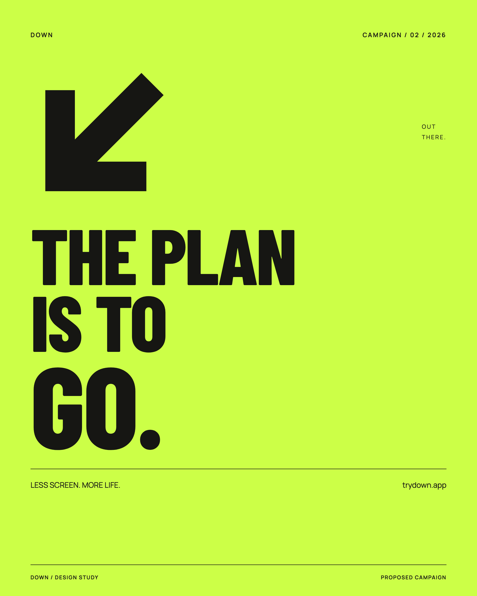
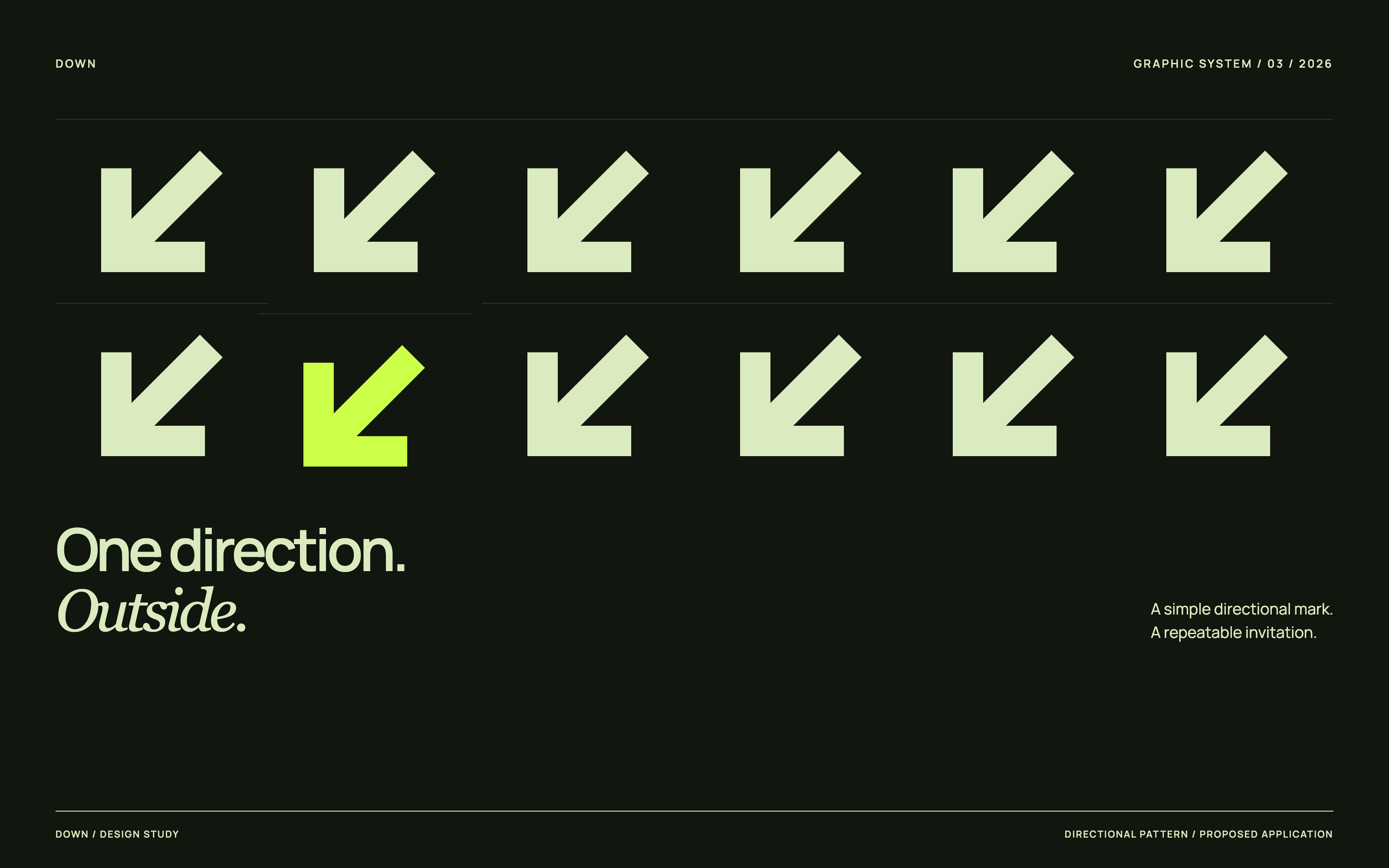
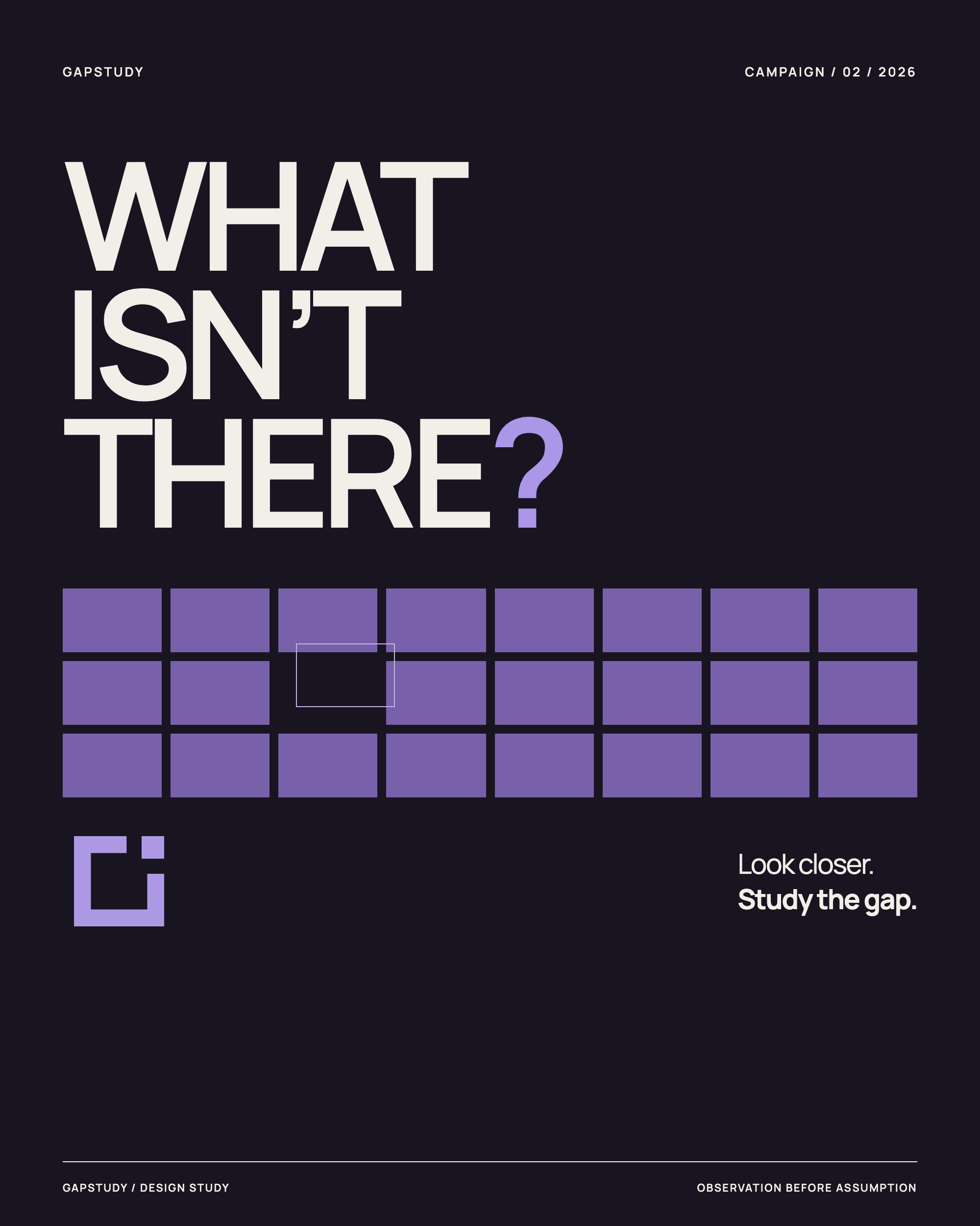
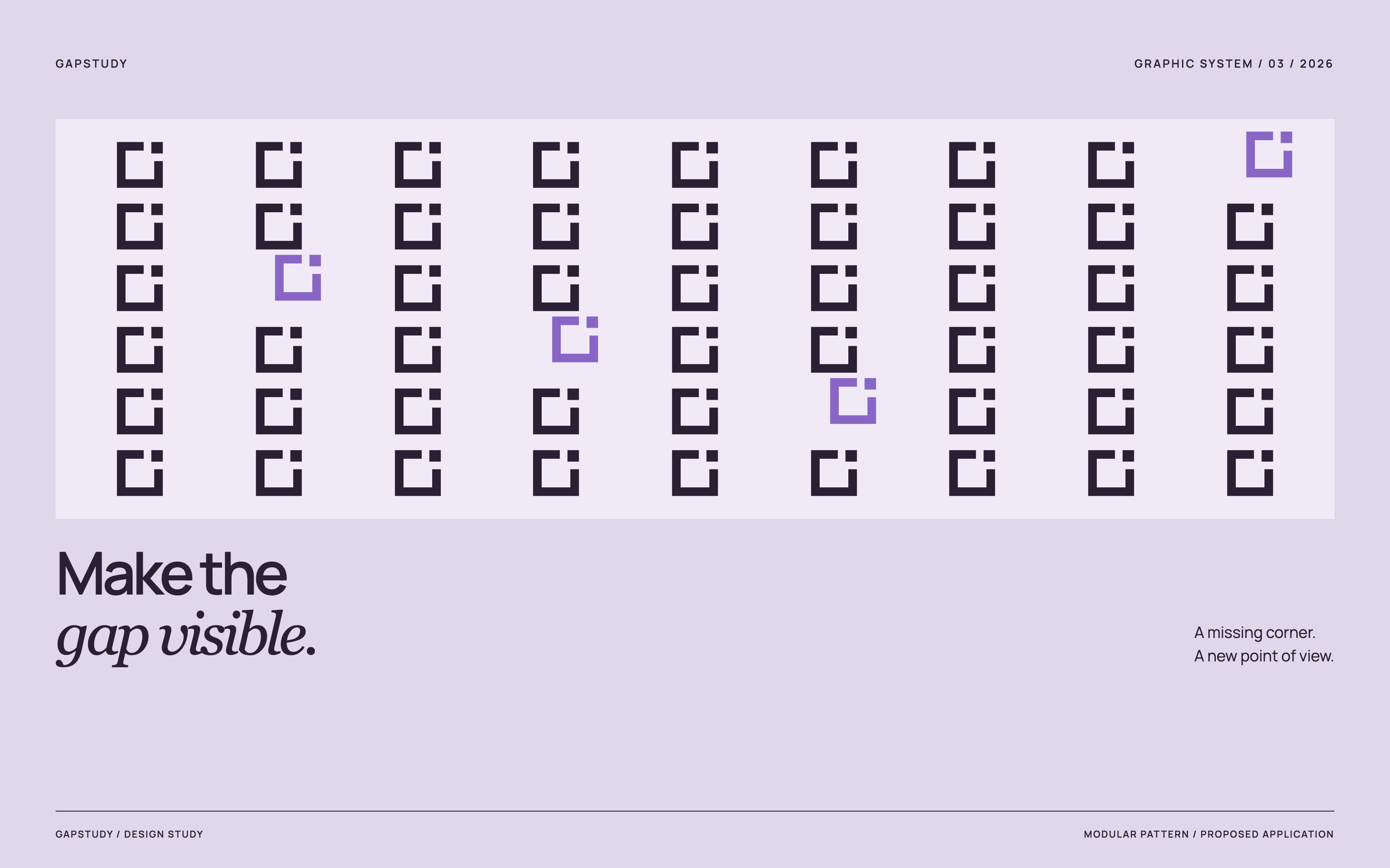
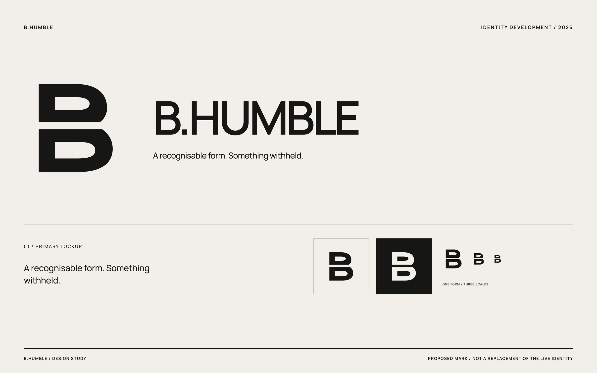
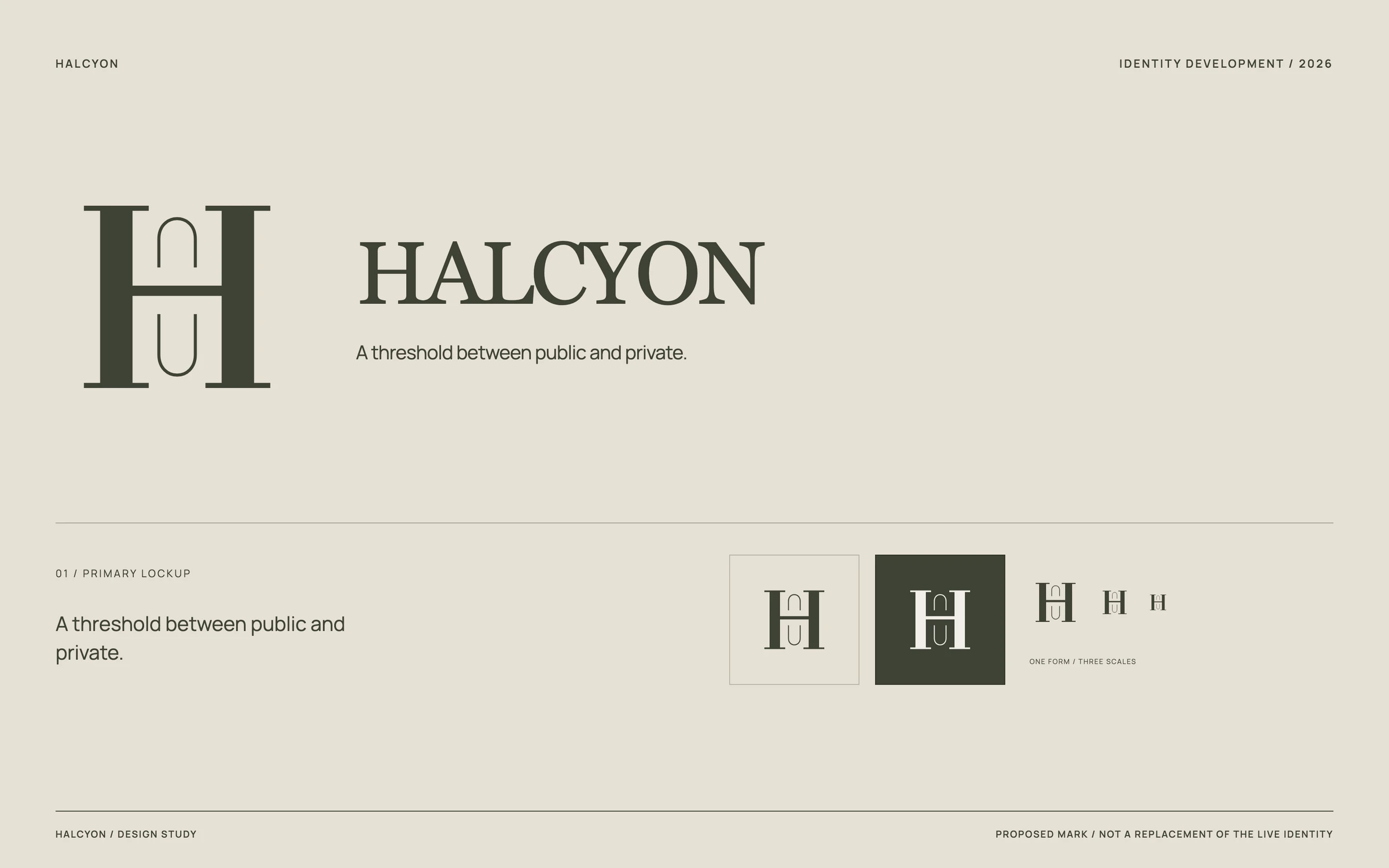
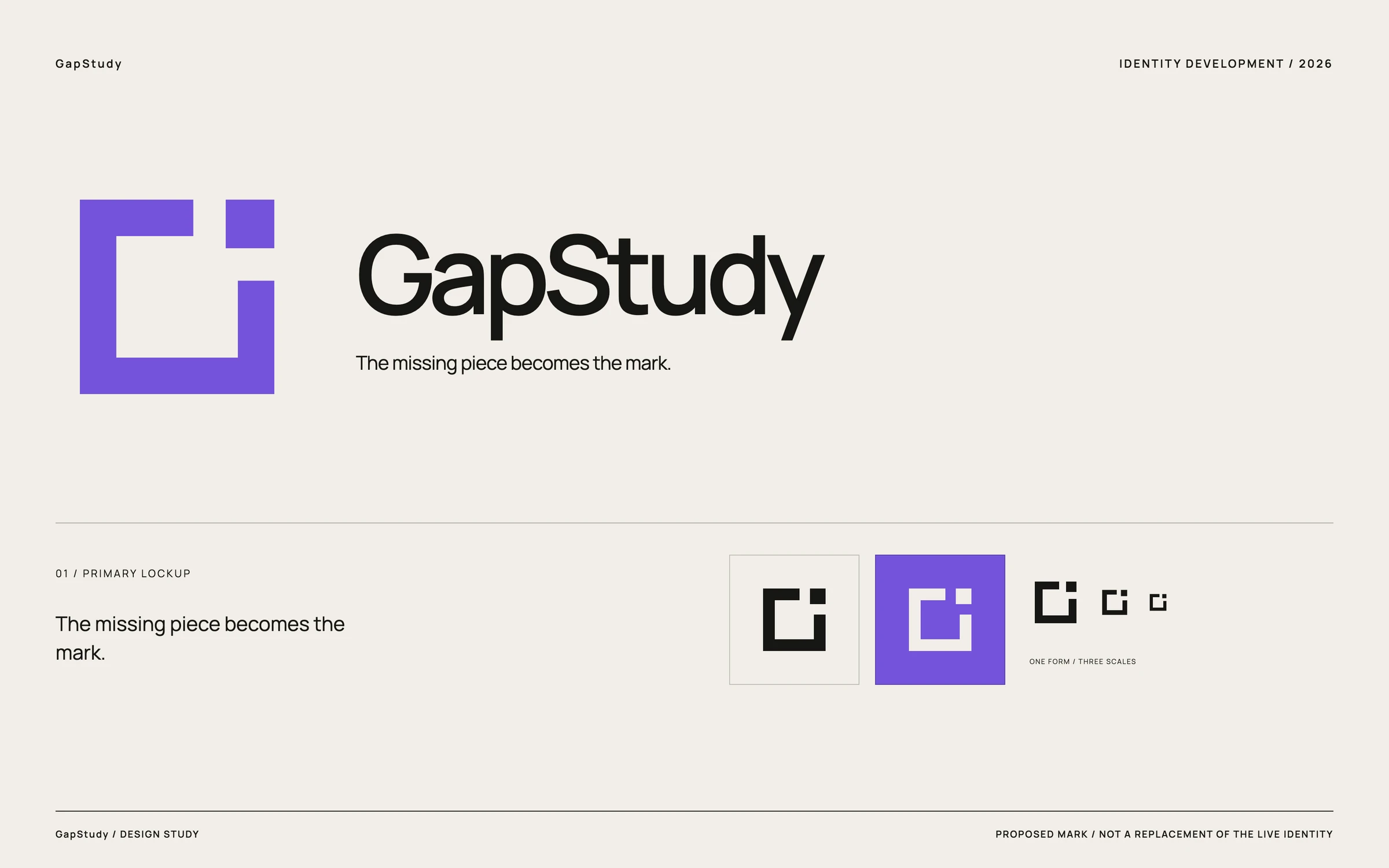
Logo development, campaign artwork and graphic systems. Existing work beside new explorations—not historical client rebrands. The original identities remain in place.
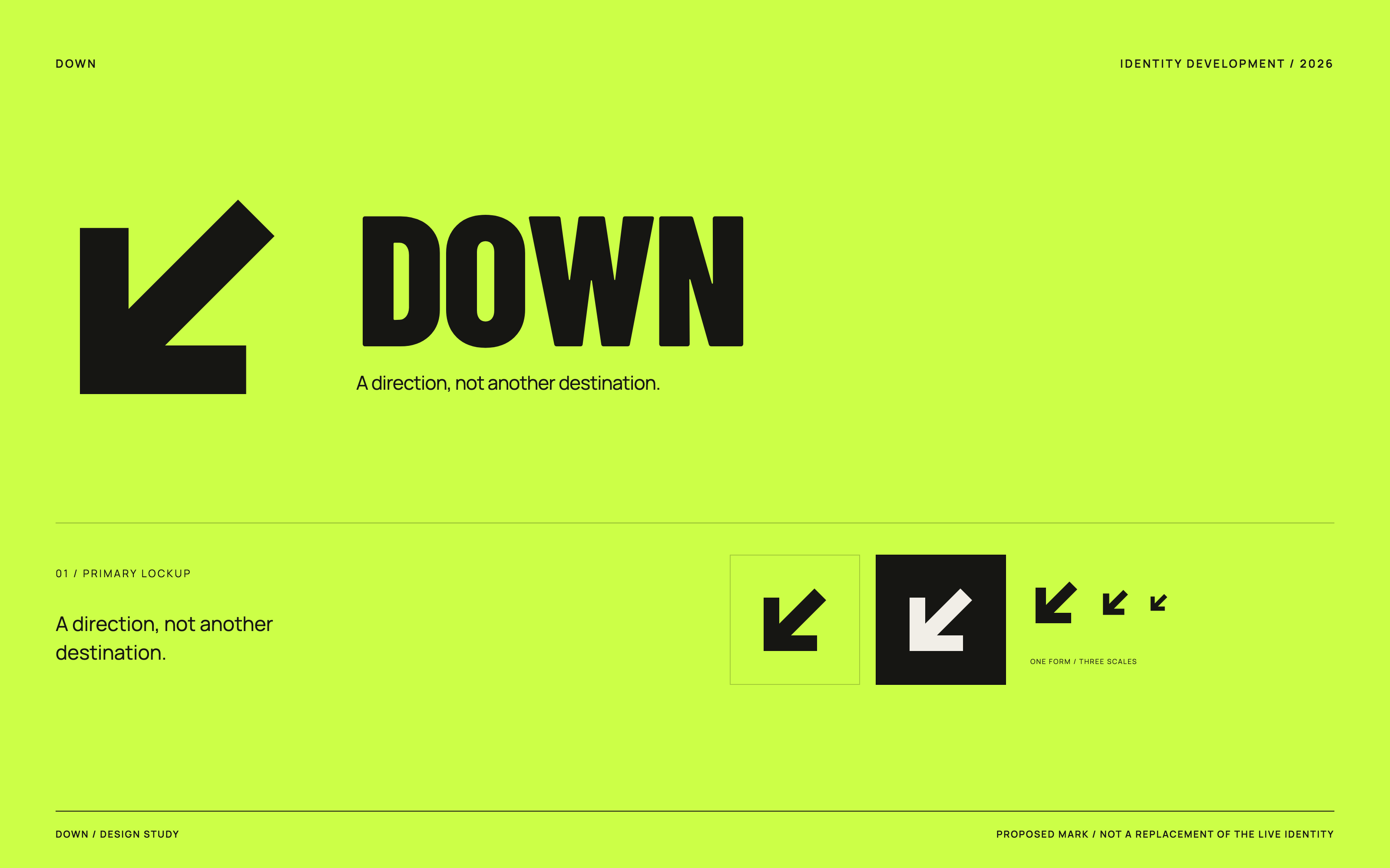
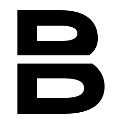
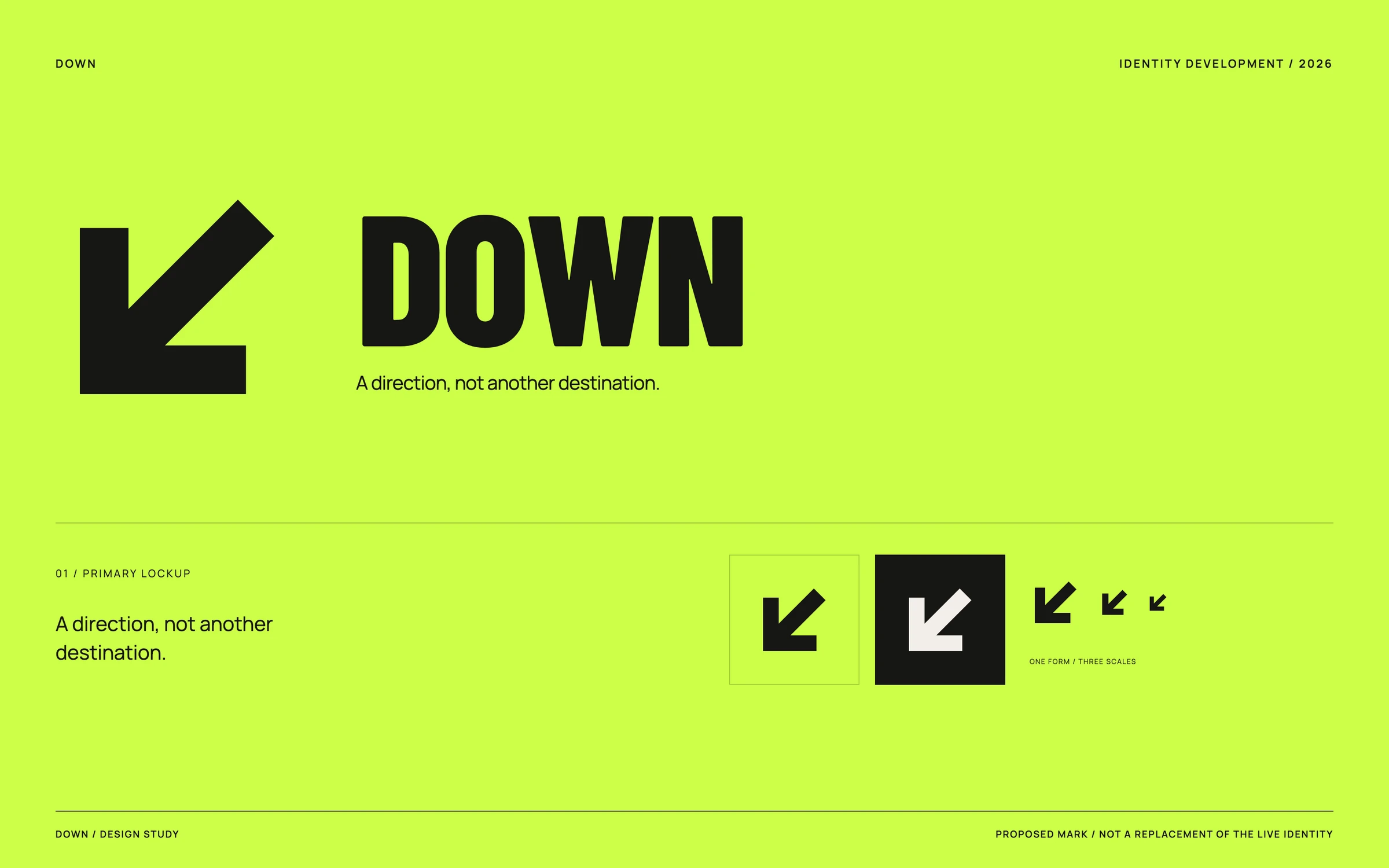
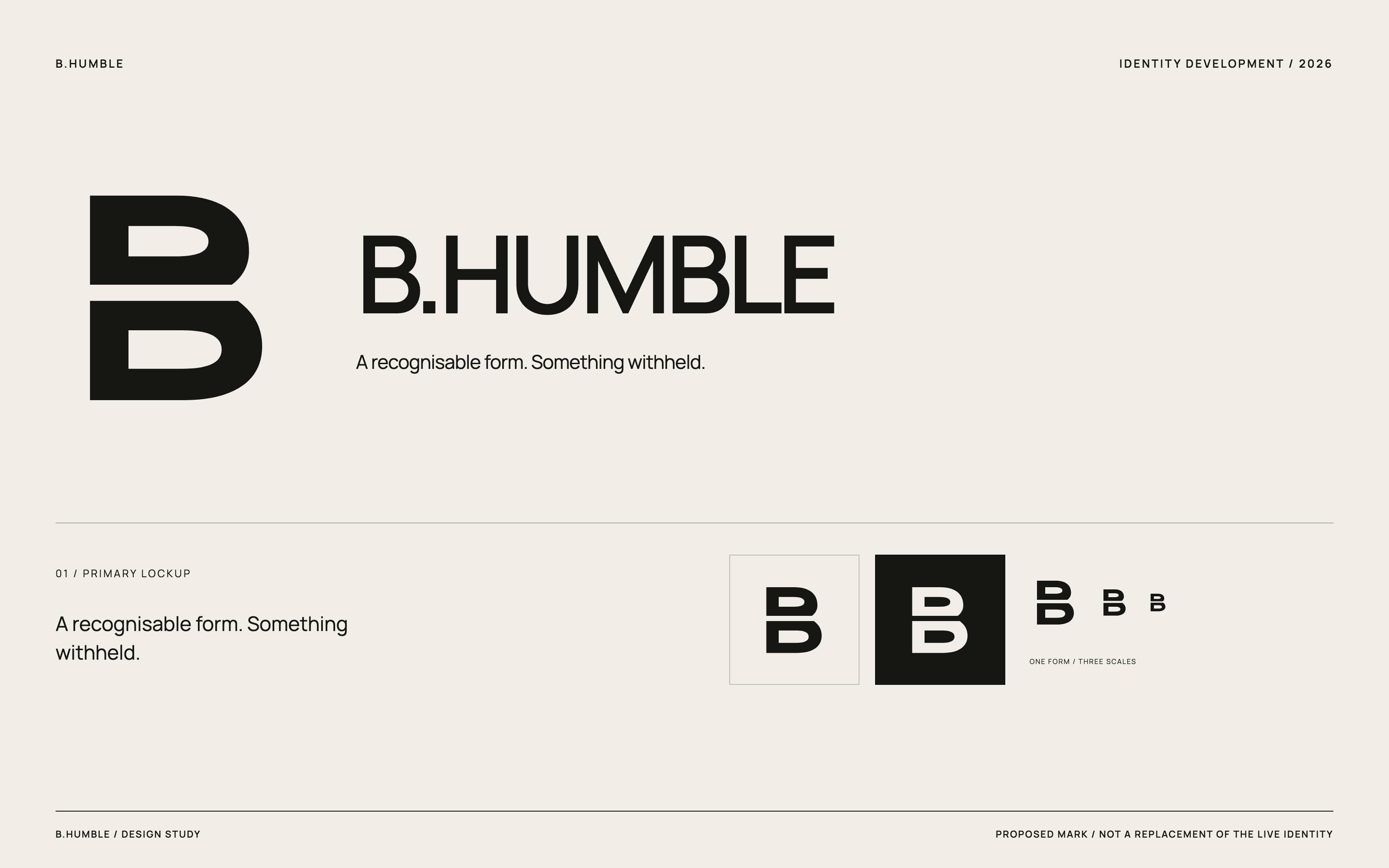
The existing wordmark and thin arrow become a condensed lockup and a single heavy directional symbol. The idea is unchanged; the shape is more useful at small sizes.
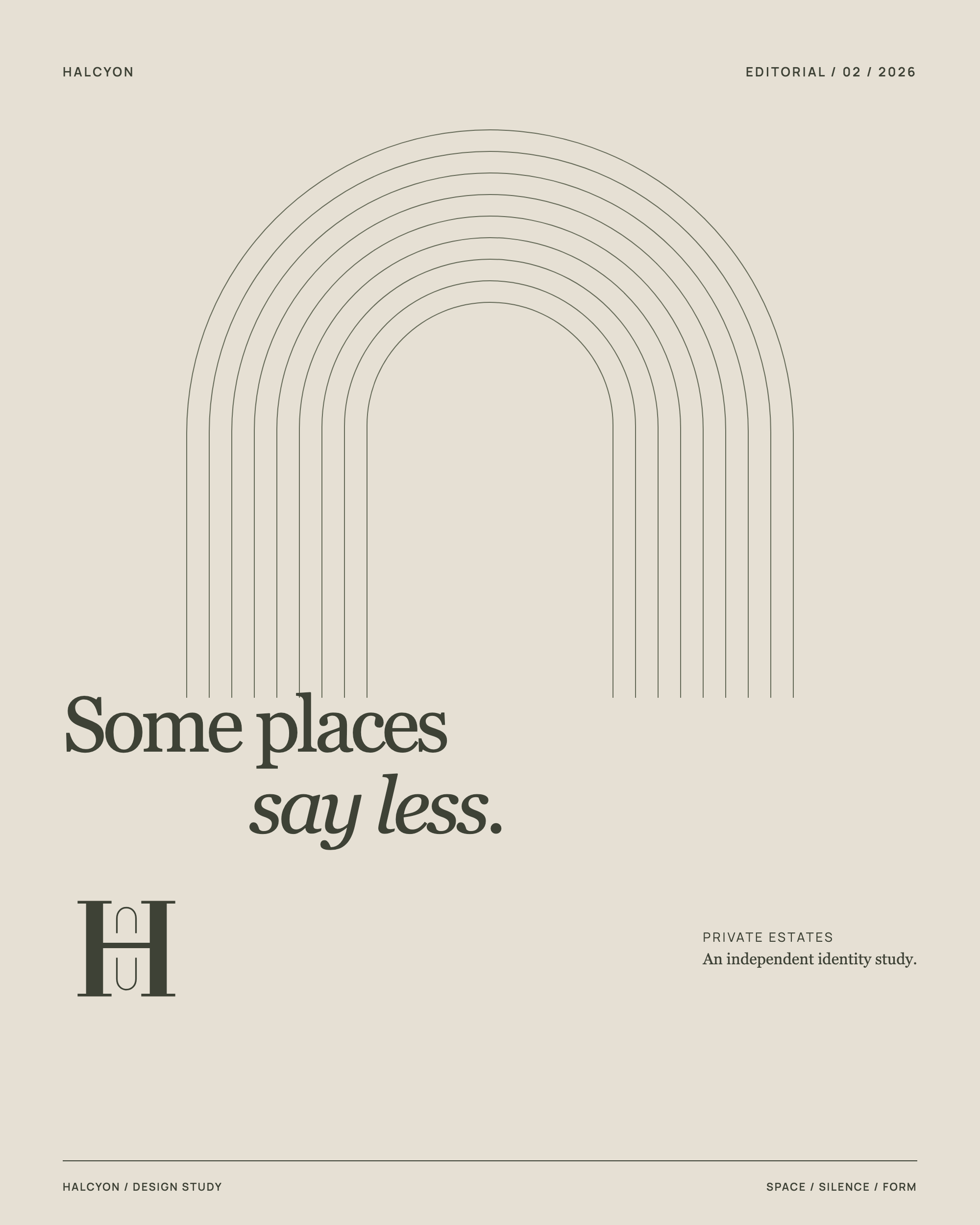
The existing image-led editorial board becomes an abstract architectural poster. Nested arches let space carry the subject.
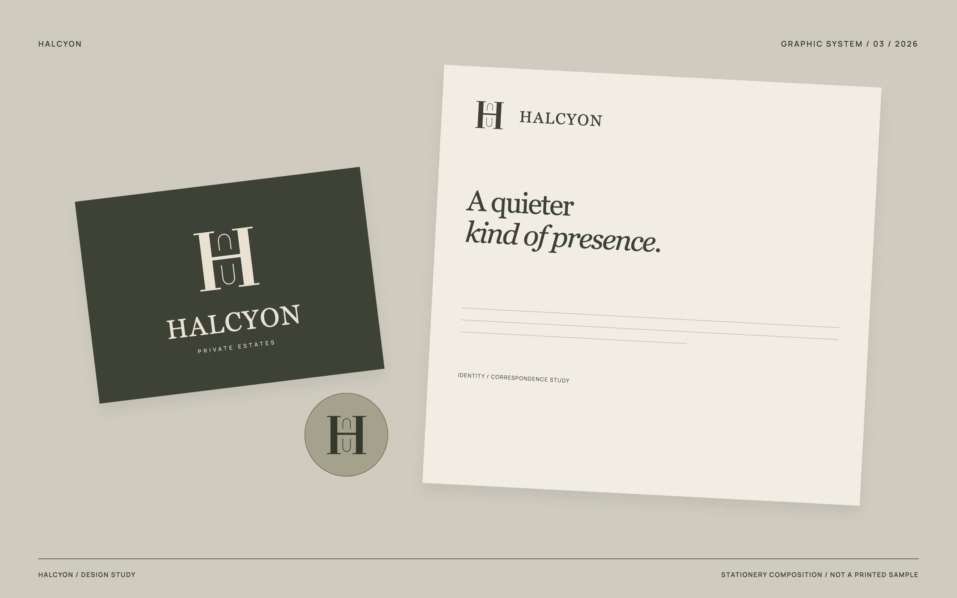
03 / Graphic system
An identity in correspondence.
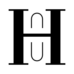
A proposed card, letterhead and seal bring the monogram into a tactile-looking composition. A graphic study, not photographed or manufactured stationery.
 Download new study ↓
 View original source ↗
 Download new study ↓